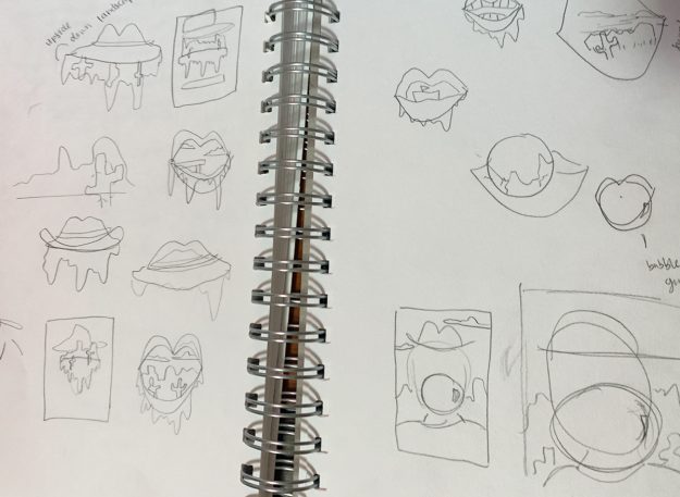
For this project, I wanted to create a country rock gig poster. The hardest part of this poster was coming up with the concept. Sketching and brainstorming were a big help. The three words I used to create this project were country, happy, and orange. From there I brainstormed different words that related to these. From there I had the concept of a mouth with a country scene inside, with a dripping liquid coming out of the mouth.

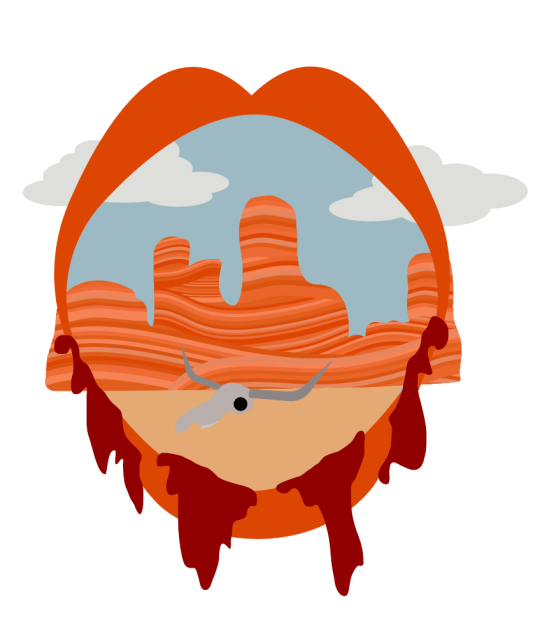
Once the sketching was done, I got right to work! I wanted to get the basics done so I could go more into detail from there. Making the canyon lines took the longest, but I love how they turned out.

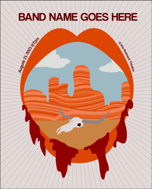
I think we can all confidently say that the draft was very rough. The skull needed the most work out of everything. The background was also very bland. As you can see below, I ended up adding lines for the background, and much more details to the school.

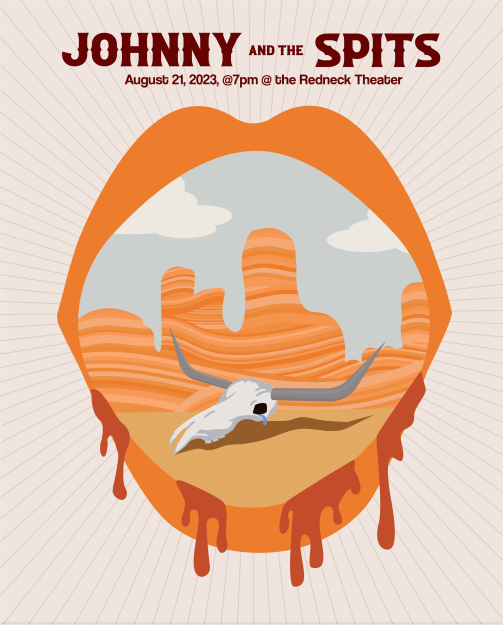
This draft was much better. I knew it could still be improved, but felt stuck on where to go next. The feedback I received was to brighten and bring down the saturation of everything but the skull to make more contrast. I also was told the drips looked chunky… which I agree with. To change the saturation, I made a rectangle the size of the posting and then did a blending mode to lighten everything. I redid the drips as well to help them flow better. After making these changes and some other little tweaks, I had the final product of my country rock gig poster!

The orange tones and canyon help bring in the Western theme, as well as the longhorn skull. The tear makes it a little more interesting, and the drips help bring the punk rock emo vibe. Everything comes together to create this intense cowboy gig poster, with a bit of fun. Would you go see this band? I sure would.
Want to check out more of my graphic design projects? Check out my podcast icons!
