For the last two weeks I have been working on the infamous… WATCH PROJECT. This means making a vector graphic that looks like a professional picture of a watch. Creating a photorealistic watch was daunting and hard work, but I prevailed! Let’s get into the details.
Starting out with sketches, I really just wanted to understand how it all went together. When creating something like this, we can’t just think about a simple watch. There are shadows and highlights and nuances throughout. I tried to figure them out on paper before I went into Illustrator.
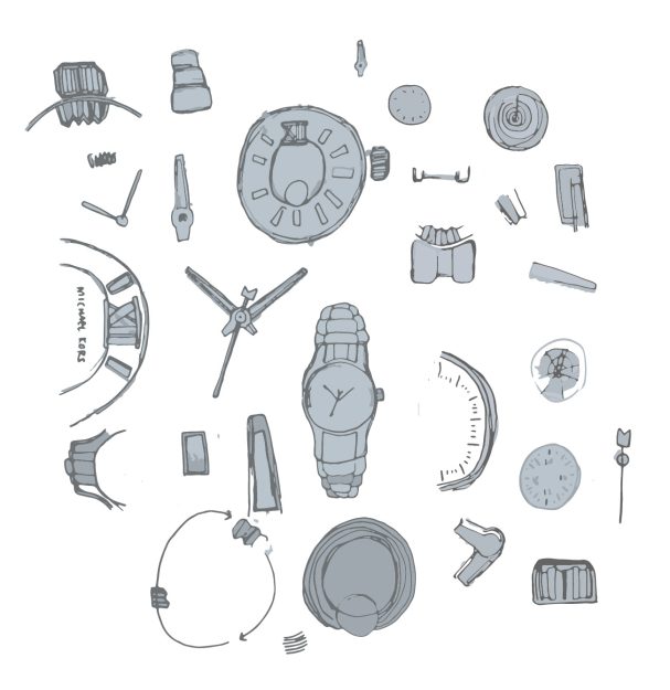
Actually starting the watch in Illustrator was a little overwhelming at first. There were so many different things to do! So I decided to hone in on different sections and just go for it. The highlights and shadows were a lot easier than I thought they would be. I relied heavily on the gradient tool and gaussian blurs.
Let’s talk about the first draft.
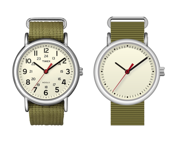
The basics are there, but the band? It’s at the very beginning stage. I received the advice of adding vertical lines to make it more like the photo.
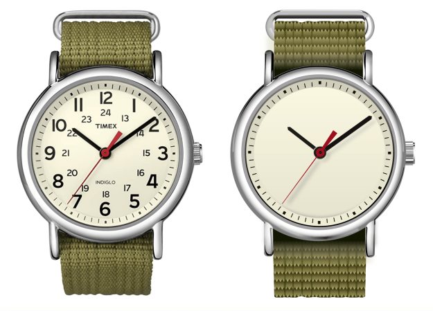
AAA! Jump scare! The band just got worse. The shadows and highlights were getting there, but still pretty rough. They don’t blend into the watch and stick out, making it obvious it was made in Illustrator.
After receiving some advice on how to fix the band and blend the shadows, we got the final product. But first, let me show you the details of the design.
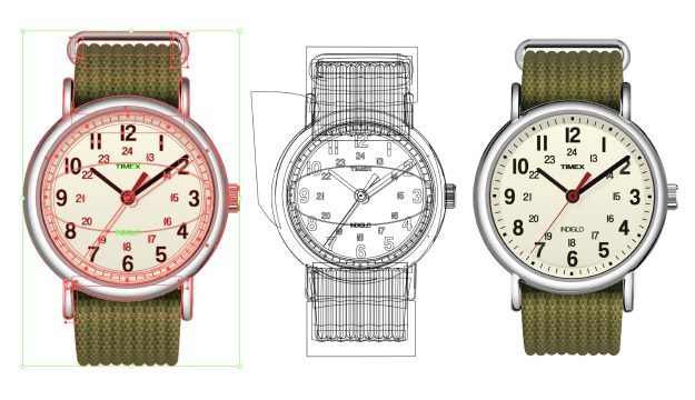
Although it looks simple, it is made out of many different shapes and lines. The picture on the left shows all the anchor points, the middle shows the outlines, and the right is the finished design.
Here is a deep dive into the band, the hardest part of this design.

After making a pattern, I used envelope distort with mesh to make it more realistic. I created vertical shadows and highlights to represent the rising and fallings of the different sections. Then I added horizontal shadows and highlights to add even more dimension. Needless to say, the band has a LOT of elements. But sometimes that’s what you need to make a beautiful, well put together design!
This was the most tedious project I have done so far. But if I can do this… I can do anything! (basically. almost.)
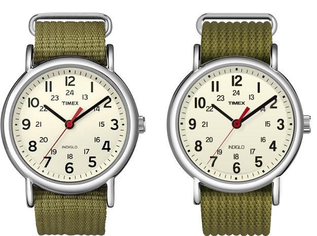
Here is the final! The picture is on the left and the vector graphic on the right. Although it is not the exact same, the vector graphic I created closely resembles the picture of the watch!
